
Designing FitAstra's first revenue stream
A fitness app for finding workout partners near you — and, with this project, for finding a coach you can actually try before committing to.
FitAstra connects you with people who work out near you. Users had partners, but no professional guidance and coaching elsewhere meant paying for months upfront. I designed the Coach booking experience, where users book verified coaches for a single session or a package, and the first version of the coach app. It opened the first revenue stream for FitAstra.
FitAstra helps you find people to work out with
It matches you with people working out near you — at your gym, a nearby park, or on a running route. The founder built it for working professionals in Bangalore who move cities for a job and end up training alone, which is where motivation usually breaks down.
I joined as a freelance product designer when the partner-matching version was live and the founder wanted to add coaching.
Users had workout partners, but nobody to guide them
A partner keeps you accountable, but they can't give you a plan, fix your form, or tell you what to do next. That's a coach's job — and getting one usually means committing to a one, three, or ten-month package before you've met the person even once. Too expensive and too risky if the coach turns out to be the wrong fit. And what if you only want advice on one specific problem?
There was a business side to this too: partner matching didn't earn anything. The Coaches tab had to work for users and become the way FitAstra makes money.
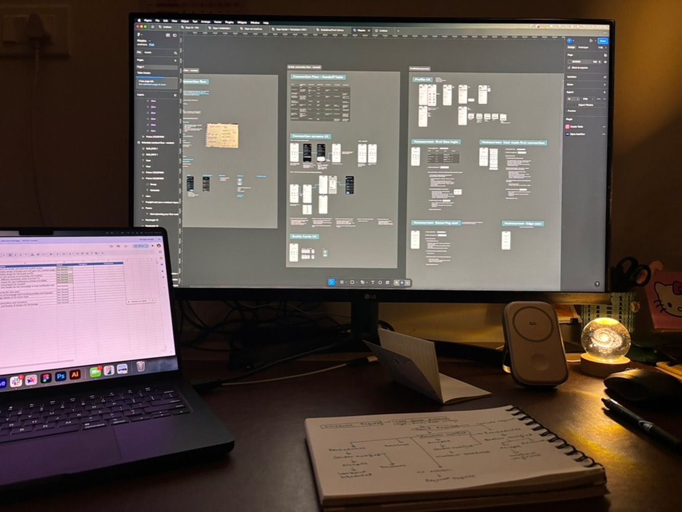
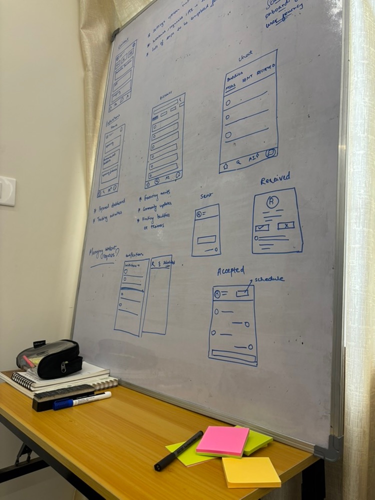
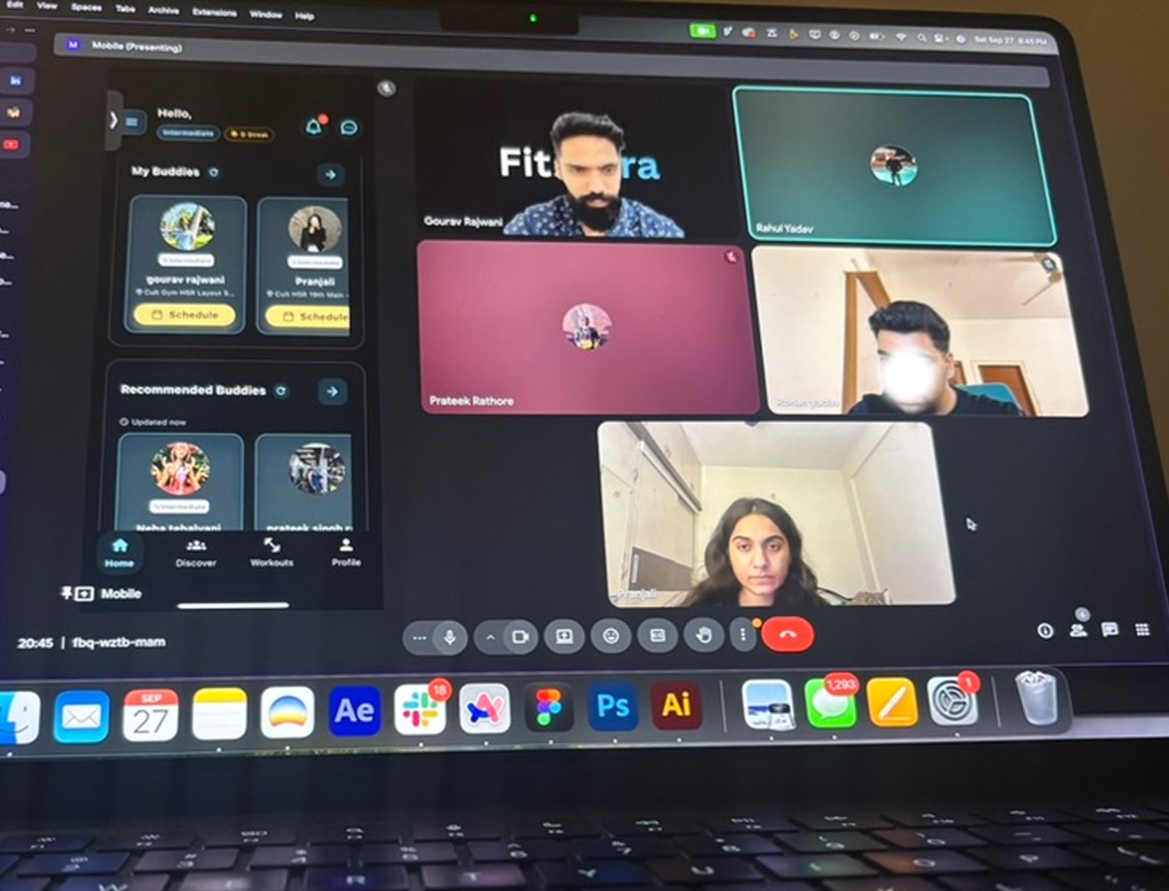
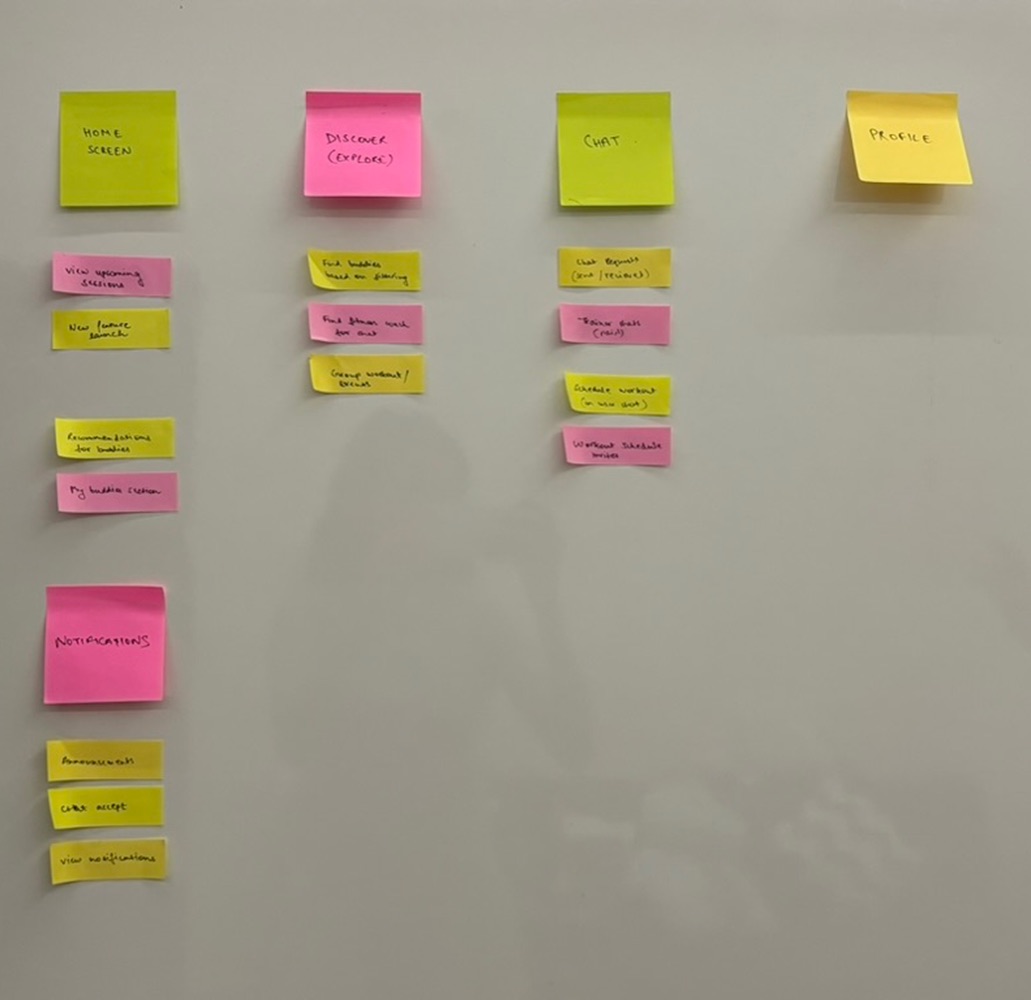
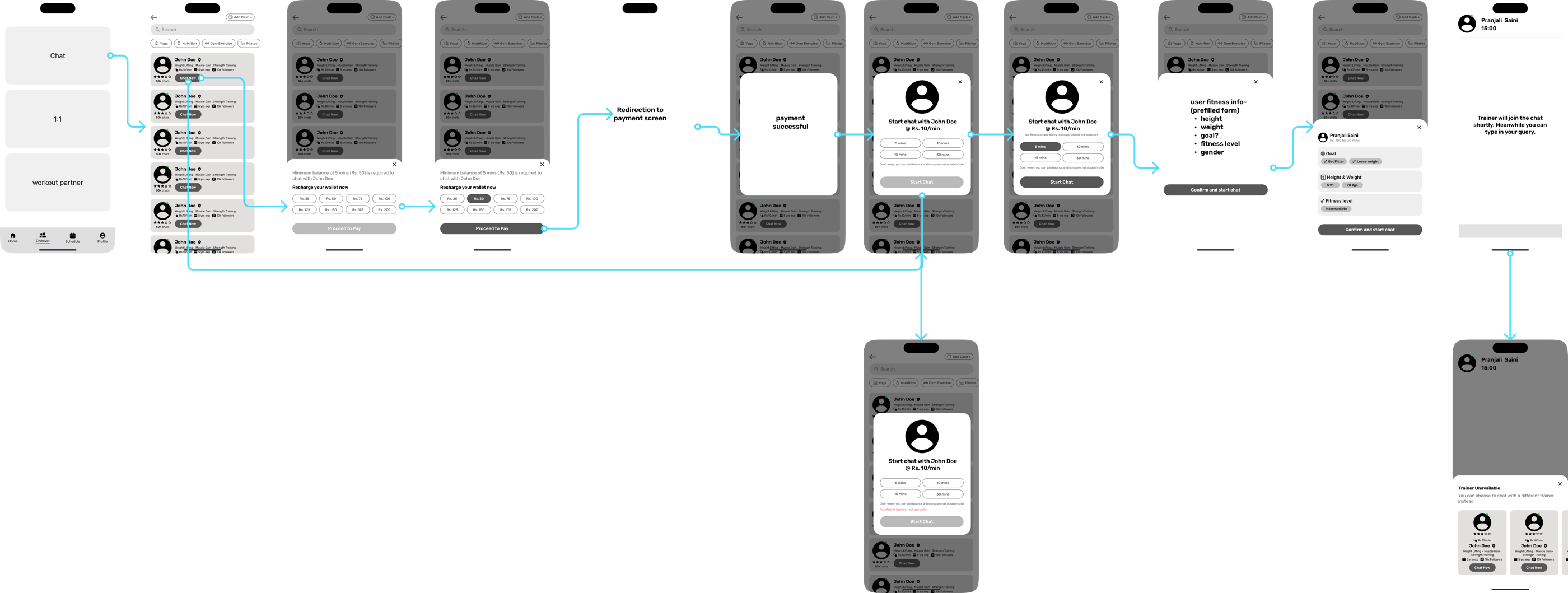
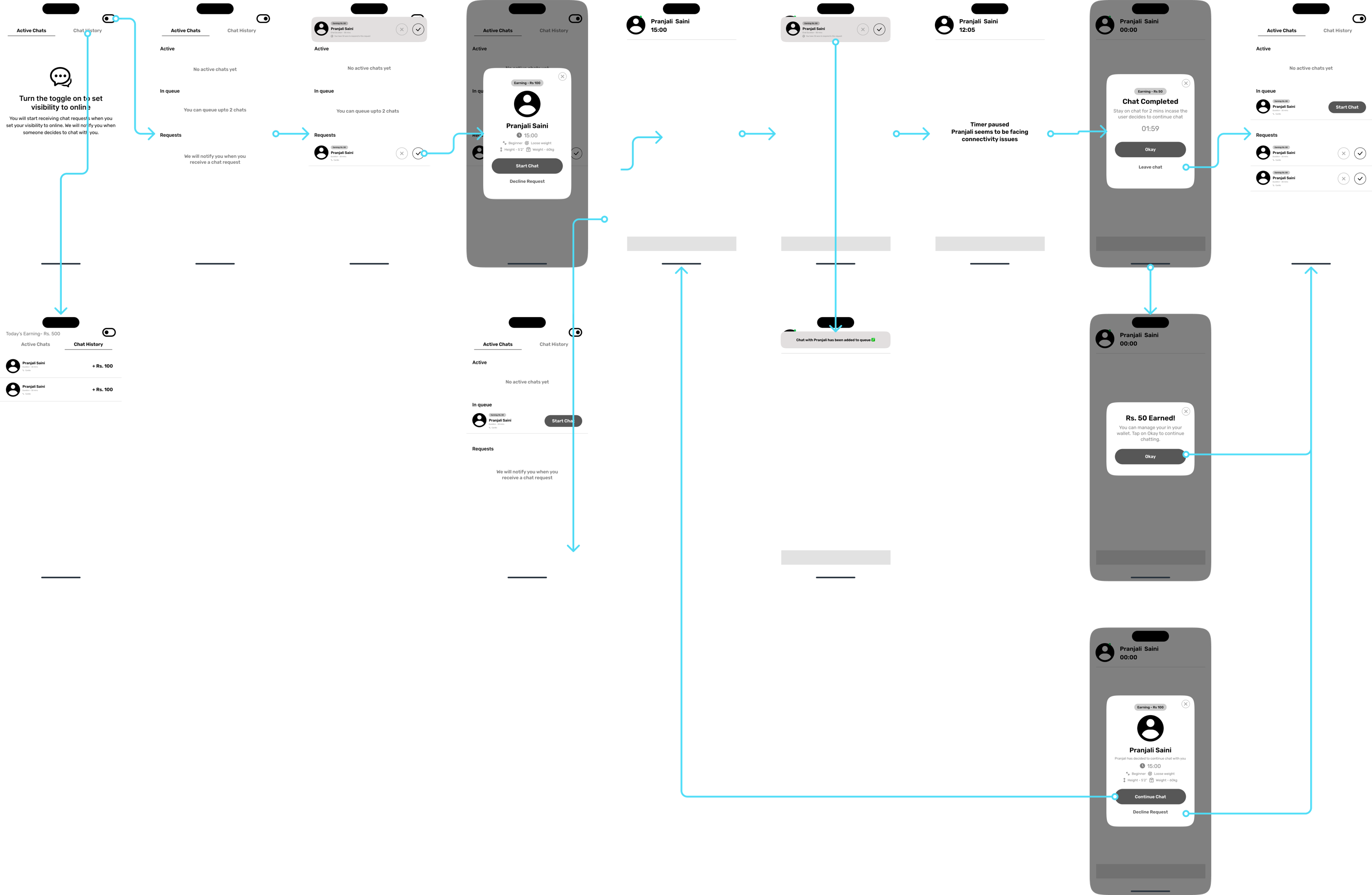
We first explored a pay-per-minute chat model
The founder's reference was Astrotalk, an astrology app where you add money to a wallet and pay per minute to chat with astrologers who are online. He wanted the same model for coaches.
Instead of debating it in the abstract, I designed the complete flow in lo-fi — wallet and recharge, browsing coaches who are online, the chat session with its timer, ratings, and the coach's side of the same model. A very early version was also discussed with our initial users. That's where the problems became concrete:
We dropped the direction. Designing it fully made that an easy conversation — the founder and I were looking at the same flows and the same user feedback, not arguing opinions.
Book a coach by the session, not by the month
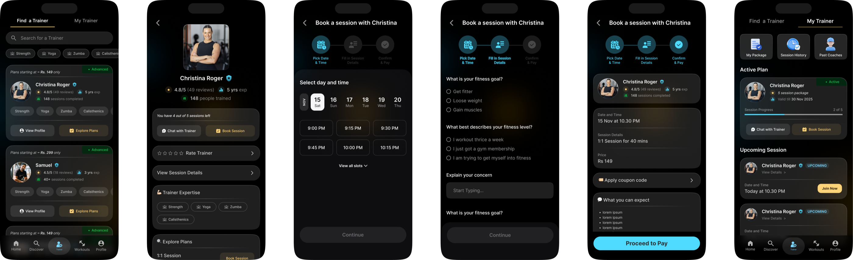
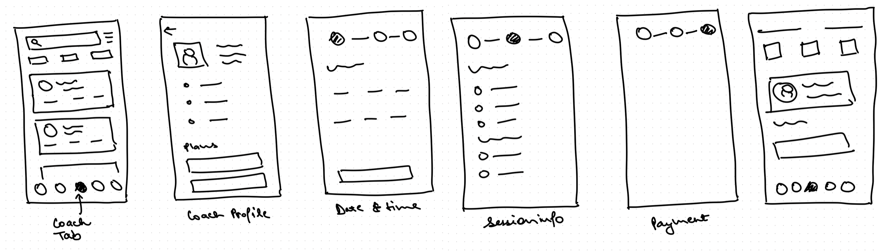
We moved to session-based booking. Users browse coaches, see who they are, and book a single session or a package. The decisions that shaped it:
Single sessions
Competitors only sold monthly packages. Here you can book one session — for a specific problem, or to try a coach before buying a package. The first session is free, which also helps new coaches build ratings early.
Named “Coaches”, not “Trainers”
The platform onboarded nutrition coaches too, not just gym trainers. The tab name had to cover both.
Pricing based on experience
Each coach's session and package prices follow their experience level, and the price is visible on the card before you open a profile.
Verification and refunds, stated upfront
Users hesitate to pay on a new platform. So every coach is personally verified with valid certifications, and if a session doesn't go as expected, the user gets a full refund. Both are shown before payment.
Designing the new coach app experience
For the marketplace to function, coaches needed their own tools. Their app covers the sessions booked with them, their active clients and each client's package progress, earnings and payouts, and their availability. Cancelling a session shows the penalty before the coach confirms it.
Freelance product designer, working with the founder who was also the developer
I owned the experience end to end: user interviews, the chat-model exploration, information architecture, flows, UX for both apps, and the documentation the developer built from.
Shipped on iOS and Android, and opened a new revenue stream
Coach booking went live as one of FitAstra's core features and gave the app its first paid product.
I worked on FitAstra in 2025 and handed the project off after launch. The app has evolved since — this case study covers the version I designed and shipped.
The app is live — try it yourself
People pay when they value what they're paying for
The things that made users comfortable booking — the coach's experience, the price, the refund policy — all had to be visible before the payment screen, not discovered after it. The goal of this project was to make the users see the value of what they were paying for.