I designed the editor experience at Zaps for creators to create and edit content quickly
Zaps went from social app to AI editor to creator tool. I designed through all three — and the unified editor was one of the major projects I owned along the way.
Zaps pivoted three times before finding its direction. Each version shipped its own editing experience — templates, photos, carousels and reels all worked differently. I designed one editor built on shared modules that works across every format, and managed a team to setup the templates library. That editor is now the core of how Zaps makes revenue.
Designing through three pivots
My role grew with each version of the app.
Photo-first social app
Users took a real-time photo, added stickers and text, and shared it in the app. I owned the interaction design — how reactions behaved, how loaders felt, the details that gave the app its character. The product worked, but monetising it needed a much larger user base than we had.
The AI experiment
AI photo trends were surging, and our face-swap selfie feature was already popular. Product and growth picked a set of countries to test monetisation — we removed the social layer there and sold Zaps as an AI editor. I designed it end to end: outfit try-ons, face features, filters. It earned, but trends are short-lived — the product needed something more durable.
Following what users actually did
In our social markets, users spent more time with our few basic drop-your-photo templates than with the AI features. That was the signal. We began the shift to a template-based creator tool — and since both experiments were still live, everything I designed had to work in both worlds at once.
Three pivots left us with experiences that didn't match
Each version had shipped its own editing experience. Editing a template worked one way, editing a photo another, AI enhancing an image had its own separate experience, and reels and carousels were different again — same app, no shared logic. Users had to relearn the basics on every surface, and every new format we wanted to launch meant designing and building an editing experience from scratch.
The product couldn't come together until the experience did. That became my main project.
Studying how people already create
Before designing anything I studied how established creator and editing tools solve the same problems. The point wasn't to invent a new interaction language — it was to use patterns creators had already learned elsewhere, so nothing in our editor needed explaining.
Browsing and searching are two different jobs
A first-time user opens the app to look around. A returning user needs a specific template, fast. The library had to serve exploratory browsing and targeted search without either one getting in the way of the other.
One module should work in every editor
Building a separate feature for templates, stories, reels and carousels doubles the work every time. This research is what pushed the design toward a shared module system.
Where people drop off inside an editor
Two findings went straight into the design: let users switch templates from inside the editor instead of backing all the way out, and surface similar templates right after a save — a light nudge for anyone who wants to keep creating.
Export isn't one flow
What someone does after finishing depends on what they made. Studying how other tools handle this shaped a share flow that adapts to the use case instead of forcing everyone down one path.
One editor experience that works for every format
Instead of an editor per format, I designed one system of modules — text, stickers, frames, filters, backgrounds. What changes per format is the canvas: a single image, a multi-slide carousel, a reel timeline. The toolkit stays the same.
Learn once, use everywhere. Every module opens the same way, in the same bottom sheet, with the same controls — whether you're editing a template, a photo, a carousel or a reel. Because the editor was unified, the modules had to scale with it: I designed each one to hold up across every use case rather than for a single surface.
New formats stopped being rebuilds. A new surface reuses the existing modules, so launching one costs days of design work instead of months.
New modules plug in everywhere. Anything we add — a new panel, a new tool — lands in every format at once, and the editor doesn't break.
All of it was designed inside the constraints of CESDK, img.ly's editor SDK. Every interaction had to be possible within what the engine supports, which forced the system to stay simple. We're now building our own SDK.
Every screen and module, in one place
The modules, their bottom sheets and controls, and the screens they build — the working file behind the editor. Pan and zoom to look around.
What real usage told us
We shipped, watched and corrected. With the product team I set up Mixpanel to study how people actually moved through the app, and we had a direct line to the creators using it every day.
Analytics we acted on
Studying flows in Mixpanel with the product team, we found a 10–12% drop-off at login. Login existed because the social app needed it — a creator tool doesn't. We removed it. Users now onboard as guests and only sign in if they're using a subscription across more than one device.
A direct line to creators
We worked with influencers to promote the app, and they used these tools heavily. Their feedback reached us continuously, and a lot of what we built came from those requests.
Stickers stopped being findable
As the sticker library scaled past a thousand assets, creators told us they couldn't find what they needed. I reworked the sticker module so the library stays browsable as it grows instead of collapsing under its own size.
Testing before release
I tested features on builds ahead of launch and owned the handoff, so what shipped matched what was designed.
The template library it runs on
The editor is only half the product — it needed a library worth opening. I set the production guidelines (how templates are built, how layers are named so tech can convert them into editable templates), then hired and ran a team of 8–10 freelance designers, plus a junior designer I managed directly. Together we built a library of 5,000+ templates across stories, wallpapers, invites, carousels and reels — the content Zaps monetises on, uploaded and managed through Retool.
When production costs grew, I proposed building our frames, stickers and fonts into CESDK as reusable assets — and it worked. A template that took a designer 30 minutes now takes about 5 — roughly 6x faster, at a fraction of the cost.
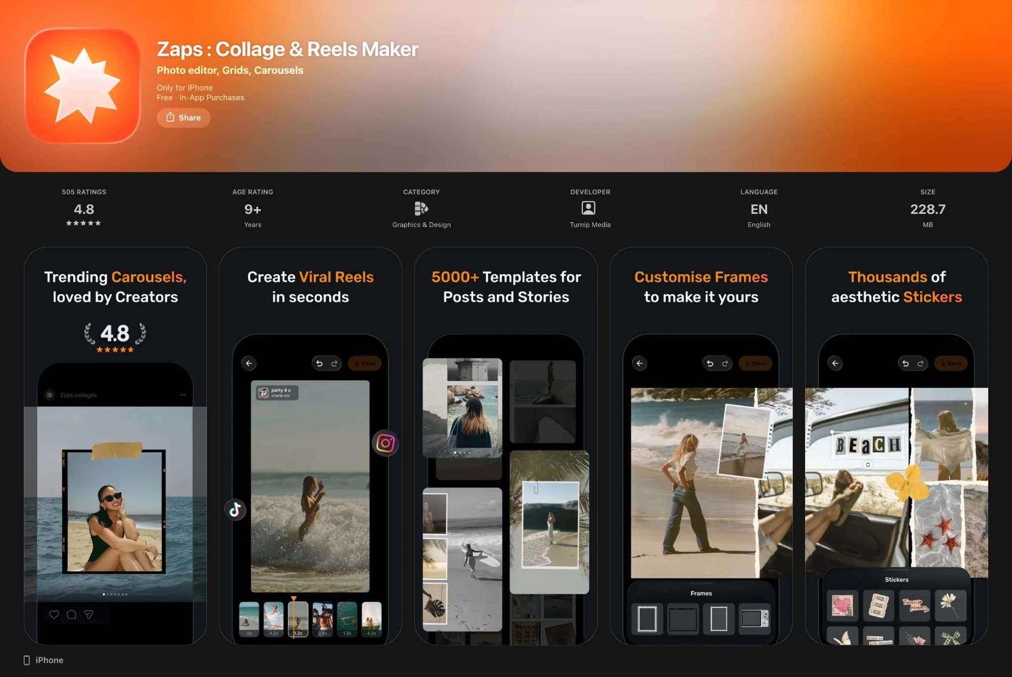
I designed the App Store screens and the marketing ads
The same system carried outside the product: the store listing that sells the editor, and the ad creatives that run alongside it.
Product designer — the editing experience, end to end
I owned the editor and the modules and features inside it — across all three versions of the app: the interaction design, testing features before release, handoff to engineering, and the template guidelines and the team producing them. Direction and monetisation decisions sat with our design head and the product and growth teams.
The numbers after the new editor and templates went live
Measured over the six months after launch. Conversion has consistently outperformed new installs — even as marketing spend and install volume have grown, the conversion rate keeps improving.
Designing for the next change is the part that compounds
Every pivot arrived as a deadline. What made them survivable wasn't designing faster — it was that the modules, the interaction language and the canvas model were already shared, so a new format became something we added to rather than something we rebuilt. The work that held up was the work I did before anyone knew what was coming next.